I like how the seaside has been slowly weathering away the subjects, creating more character, texture and feeling to the picture.
But I will let you decide about that...


Hope you liked them!

 Free French Memorial - Lyle Hill - Greenock.
 Fuengirola beach statue of Virgen Del Carmen - Spain.
 Troon War Memorial.
 Troon Anchor.
 Troon War Memorial.
 Glasgows Duke of Wellington Statue.
 Silloth Harbour.
 Skinburness Lighthouse.
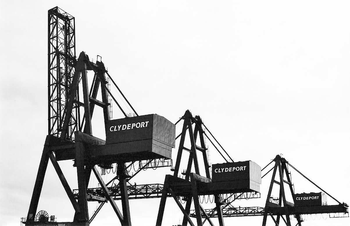 Greenock Shipyard.
 Port Glasgow Shipyard.
 Fuengirola Beach - Spain.
 Skinburness Lighthouse.
 Small Rowboat Silently Still.
 Lonesome Cottage lakeside retreat.
 Rustic Boathouse.
 Water Tree.
 Group shot of BTN.
 Overexposed headshot of Bass player.
 Overexposed headshot of Lead Guitarist.
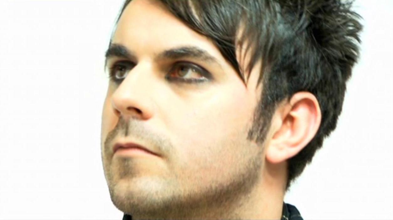 Overexposed headshot of synth/keys player.
 Overexposed headshot of Lead Singer.
 Close-Up of Mic.
 Group shot, utilising depth of field.
 Red directly contrasting and highliting the minimal white.
 Fashionable and stylistic Guitar pose cinematography.
 filming though 35mm photographic film to create an interesting and moody image.
 The TV was a requirement from my director, I like its conceptial element to it.
 This was done by filming through a red lightbulb. I like its moody and more abstract effect.
 Guitar Strings CU through the other side, creating an interesting and abstract use of cinematography.
  Simple and basic structure of Girls bedroom.
 I decided to liven up the Mise-en-scene with a deep purple paper for the center wall to give the room more depth and interest.
 I felt that the space needed something more interesting than wallpaper. I wanted to make a window, as both a source of light, and simply to make the room more realistic and interesting.
 The window was to be the main focal point of the room, as most windows are, it also helps towards tying the room together better.
 The window acts as a warm source of light, complete with lamp to help set the mood. the bed and set dressings go together to help build the rooms presence.
 Final photo of end result minus the television and Jersey Budd poster.
 Basic wall structure to form the basis of the main performance area.
 This was my choice in wallpaper. I liked its nostalgic connotations.
 Wallpaper fully covering the wall, organizing the picture frames in a cluttered pattern to fill the wall.
 Setting the picture frames up to create the sense of clutter and style.
 Final result. The pictures in white would be containing the live action scenes where the camera would travel into.
 Final photo of both sets completed.
I first approached this production as a chance to really express myself both creatively and technically...
Unfortunately, as an Art Director, or Production Designer, your limited by your Directors creativity... which unfortunately hindered my hopes for this project from the offset.
My resulting opinion of this production and the Music Video is that of remorse. I feel that my failure to produce something visually interesting, is a learning experience I wish I didn't have to go though, but I feel motivated to learn form this mistake and move on with my work.
As you will tell from viewing the video that the concept I had been given was changed, and replaced with a series of unattractive motion graphics, and questionable camera angles... Hope you like it...
Although I am not proud of my work in this production, I feel that it is important to learn form ones mistake and there fore I feel it is important to show you the video not just for the sake of it, but for me.
 Ullswater ferry.
 Small empty jetties help to frame the picture nicely.
  Solitary boat silently waiting.
 Water capturing the reflection perfectly.
 Misty hills rolling.